
Start With The Smallest Text On The Job
When we review artwork for flexo photopolymer plate-making, the first step is to find the smallest text on the layout. That includes ingredients, legal notes, batch spaces, panel copy, barcodes with human-readable numbers, and any reversed type. Once you know the worst case size, you can set the rest of the artwork around it.
Small text behaves differently on film and on press. A point size that looks fine on screen may close up once it is reproduced on plate, especially on rough board, stretch film, or light coloured substrates with a strong dot gain. As a general rule, keep the smallest text as clean as possible, with enough spacing and strong contrast. If the job is going onto packaging for humid areas like Durban or warehouse storage in coastal towns, allow extra tolerance because moisture can affect board, ink laydown and registration.
- Identify the smallest printed element on every panel.
- Check reversed text, outlined text and text over patterns.
- Keep legal copy separate from decorative copy where possible.
- Use one final artwork version for all plate planning and proof comparison.
Choose Type That Holds Up On Plate
Thin fonts and compressed styles can become fragile during plate making. For small text, choose a simple typeface with open counters and steady stroke widths. Avoid very light weights, script styles and decorative faces unless the size is generous. On narrow labels or cartons, it helps to use a slightly bolder weight rather than trying to force too much copy into a tight space.
Letter spacing matters just as much as font choice. If letters are too close, ink spread can join them together. If spacing is too wide, the line can look broken and uneven. In most cases, neat spacing with enough breathing room works better than squeezing the copy. Do not reduce the text size simply to fit a layout, because that often creates a plate that is hard to print cleanly.
- Use clear sans serif or simple serif faces for fine copy.
- Keep line spacing generous enough for legibility.
- Avoid setting small text in all caps unless it is truly necessary.
- Check that punctuation, accents and symbols are still readable.
Watch Line Weight, Reversal And Knockout Areas
Very fine lines around small text can disappear during processing or soften on press. Borders, rules and box lines should be thick enough to survive plate reproduction. If the text is reversed out of a solid or a tint, the knockout must be large enough that the letters do not fill in. This becomes even more important on flexo jobs where plate relief, anilox choice and impression pressure all affect the final result.
For line art next to small text, keep enough space between the copy and the frame. Crowded layouts tend to lose clarity after trimming, mounting and printing. Where possible, avoid placing small text over a busy image or textured background. If that cannot be changed, simplify the background or move the text to a cleaner area of the artwork.
- Use line weights that stay visible after plate processing.
- Allow safe margins around reversed text.
- Keep small copy off busy backgrounds.
- Check that rules, borders and boxes do not touch the letters.
Prepare Artwork Before File Checking
Good plate results start with tidy files. Before sending a job for artwork preflight or file checking, make sure the text is outlined only when needed and that the live text is still editable where practical. Missing fonts, low resolution images and mixed colour builds can all affect how small text is handled. When text sits close to images or dielines, review the full spread before final approval.
Imposition planning also matters. If the layout shifts between repeats, panels can move closer to trim edges or fold lines. Small text should never sit too near a cut line, especially on labels or cartons that may be trimmed slightly differently on the machine. A few millimetres of safety space can save a remake and help the final plate mount more accurately.
- Check fonts, links, colours and overprints before submission.
- Keep critical text away from trim and fold lines.
- Leave room for plate trimming and mounting tolerances.
- Confirm that file names and version numbers are correct.
Use Proof Comparison To Catch The Hard To Read Parts
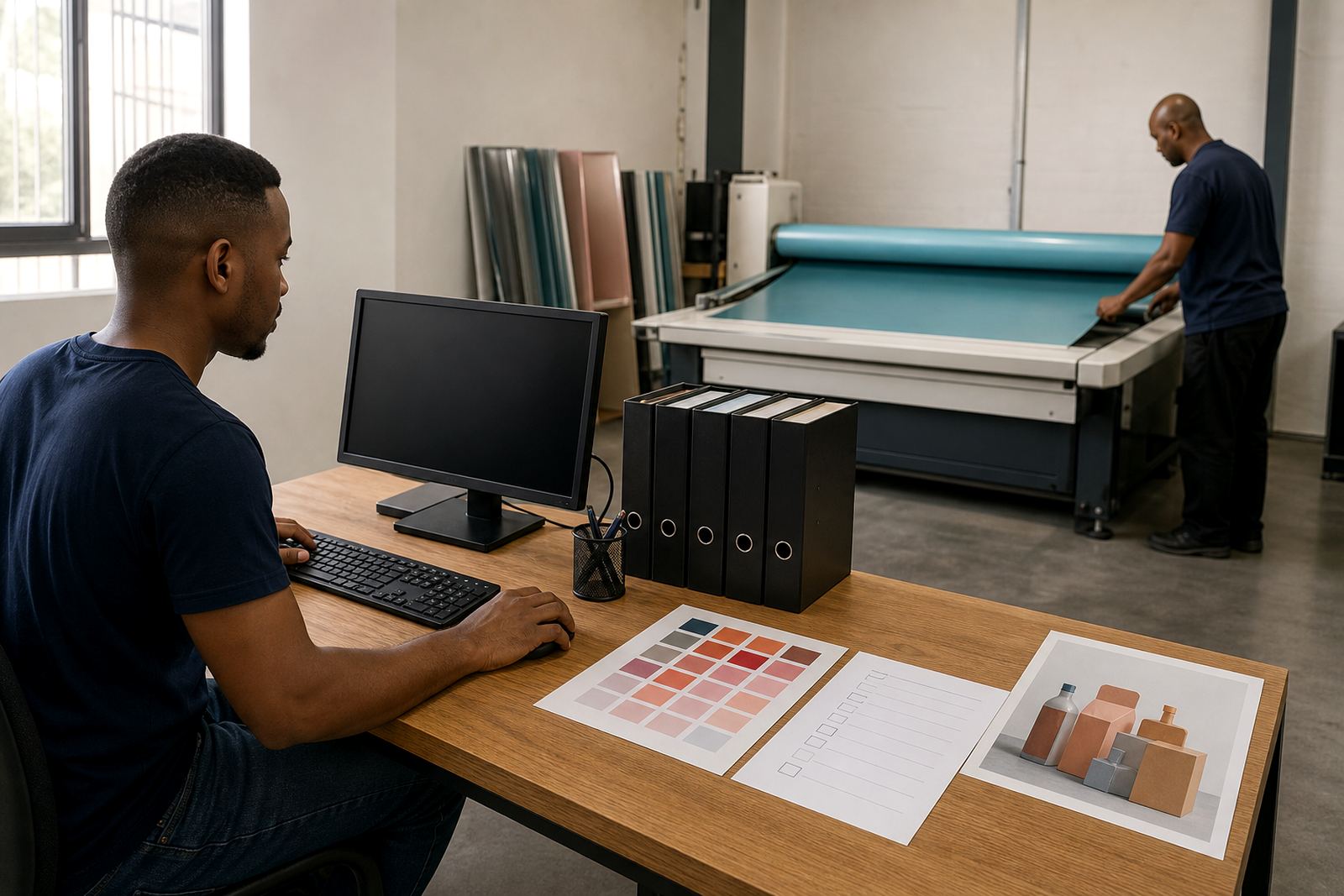
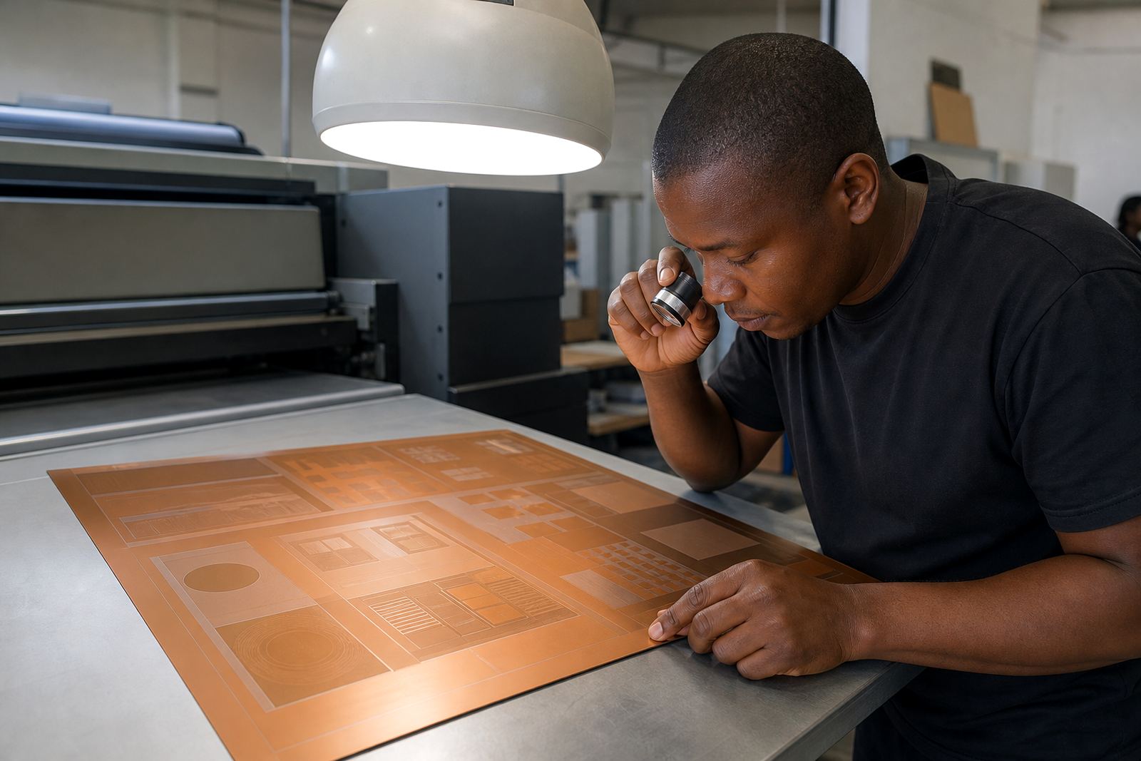
Proof comparison is one of the best ways to catch small text problems early. Look closely at each version, not just the overall layout. Compare punctuation, line breaks, decimal points, and numbers that can be mistaken for one another. A proof should be read under good light and at the size it will appear on the final print, not only on a large monitor.
For label and packaging printers in Johannesburg, Pretoria, Midrand and the East Rand, this step helps reduce last minute corrections before dispatch. It is much easier to adjust artwork before plate making than to chase tiny copy after the job is on press. If a line seems too tight, too light or too close to another element, note it clearly so the correction can be made before production.
- Read proofs line by line, not only paragraph by paragraph.
- Check figures, dates, codes and units carefully.
- Compare every revision against the previous version.
- Mark unclear areas before approval, not after printing.
What To Tell Us Before We Make The Plates
When clients use our enquiry form, the more detail they give, the easier it is to advise on small text. Tell us the substrate, print method, repeat size, and whether the job is for labels, cartons or another packaging format. If the artwork has unusually fine copy, say so at the start. That lets us review plate making, screening support and mounting details with the text in mind.
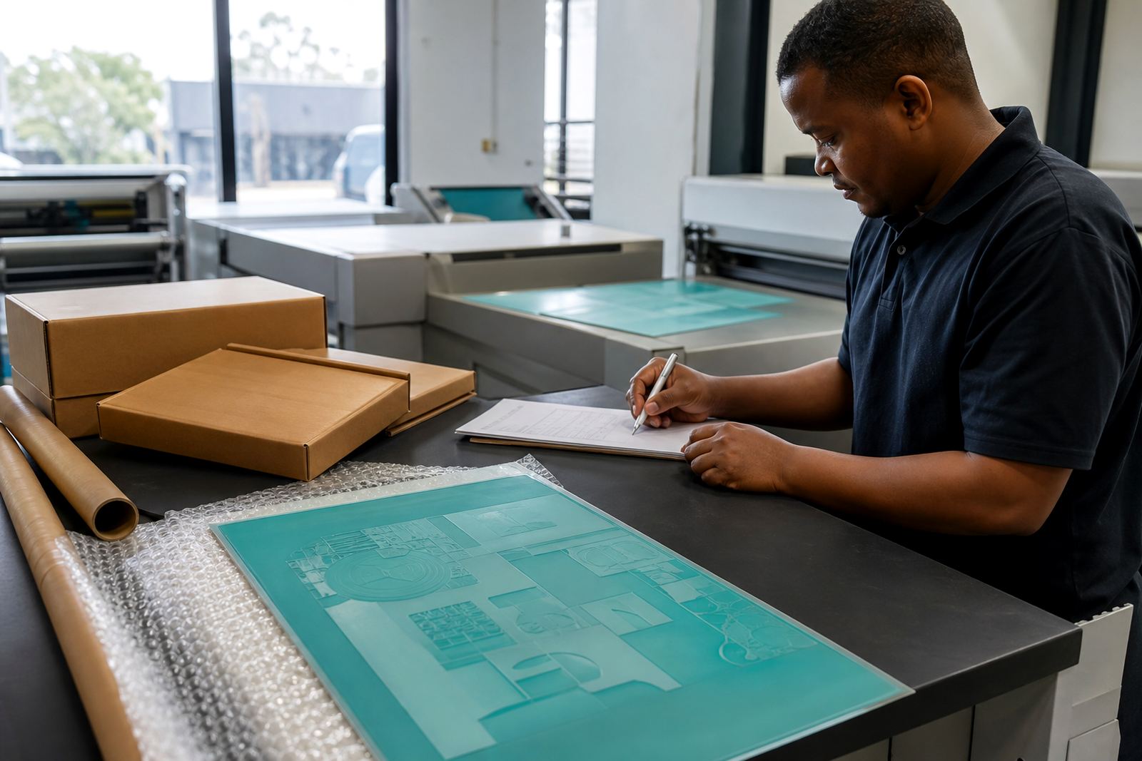
For Midrand and surrounding Gauteng areas, we handle collection coordination and dispatch packing, with courier delivery across South Africa including Johannesburg, Pretoria, Durban, Cape Town and Gqeberha. If a remake is needed, it helps to know exactly which text changed and which side of the layout was affected. Clear notes save time and reduce confusion during production.
- State the substrate and end use.
- Flag all small text, reverse text and legal copy.
- Send the latest artwork version only.
- Note any rush collection or delivery requirements.