
Why a curved bottle changes the label before it reaches press
A flat artwork file can look perfect on screen and still behave differently once it wraps around a glass bottle, PET container or slim aluminium can. The curve changes the visible width of the label, and it can also shift the way text, borders and logos sit near the shoulder, base or seam. If the artwork is not planned for the container shape, the final label may look slightly compressed on one side or stretched on another.
That is why beverage label work needs to be reviewed as a shape problem as much as a print problem. A label for a 330 ml bottle in a tasting room is not handled the same way as a label for a 750 ml bottle going through a busy filling line in Midrand or Ekurhuleni. The container profile, glue zone and print position all matter, and the plate-making stage should reflect that from the start.
For printers, the main goal is simple: make sure the label still reads cleanly once it sits on a curved surface. Small changes in layout can prevent headaches later, especially where the brand name, legal details and barcode all need to stay clear.
What to check in artwork before plate-making starts
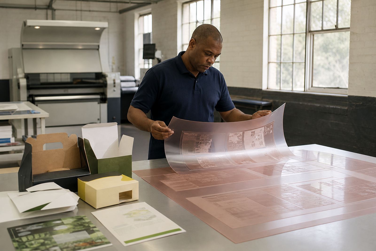
Before plates are made, the artwork should be checked for shape, measurement and practical print limits. This is where preflight work earns its keep. A clean file is not only about image quality, it is also about whether the label is set up to suit the container and the press conditions.
- Confirm the exact label panel size, including trim and bleed.
- Check the container diameter and how much curve the label must follow.
- Look at seam placement so key text does not land in an awkward position.
- Review fine type, line weights and reversed text for readability on a curve.
- Check barcode placement so scanning remains reliable after application.
- Make sure all colours and screens are suitable for the print method being used.
In practical terms, this avoids a lot of back-and-forth once the job is on the production side. A small layout adjustment today can save a remake later, and on a beverage run that can mean less waste, fewer delays and less pressure on the line. It also helps when the same label has to work across different container formats, such as 275 ml, 340 ml and 500 ml packs.
How curves affect colour, text and image placement
When a label wraps around a curved bottle, the eye does not see every part of the design in the same way. Areas nearer the front of the container appear stronger, while sides and edges can fall away faster than expected. That means artwork with tight borders, repeated patterns or small copy may need careful positioning so it does not look pinched after application.
Colour also needs consideration. On a curve, solid blocks can show slight variation in feel depending on how the light hits the pack. Metallic effects, dark solids and fine reverses can be more demanding, especially on packaging that will sit in cold rooms, near condensation or in coastal humidity. For Cape Town or Gqeberha dispatches, that sort of moisture can be a real factor if the label stock and press settings are not matched properly.
Text is often where issues show first. Legal copy, ingredients and small tasting notes must remain readable after application. If the curve is tight, it may be better to widen the panel slightly or move essential text to a flatter portion of the container. That kind of decision is best made before plate-making rather than after the first print sample.
Using proof checks to catch curve issues early
Proof comparison is one of the most useful steps in beverage label work. It gives the printer a chance to compare the artwork against the intended container and look for problems before production starts. For curved labels, that comparison should include how the design flows around the wrap, not just how it looks flat on paper.
A good proof check can highlight:
- Text that sits too close to the seam or overlap
- Logos that appear off-centre once wrapped
- Barcodes that need more clear space
- Fine screening that may need adjustment for plate output
- Areas where the image should be rebalanced to suit the bottle shape
Where needed, technical job advice can help the printer decide whether the layout needs a small change or a full rework. This is especially useful for runs that move between Johannesburg, Pretoria and Durban, where different filling plants may use slightly different containers or application settings. A clean proof check helps keep the job moving without surprises later on.
Local beverage jobs need practical planning from Midrand to the coast
From a Midrand base, beverage label work often has to suit a wide range of South African conditions. Inland jobs may deal more with dust, heat and line speed, while coastal deliveries can bring extra moisture and storage concerns. If plates are being dispatched to Cape Town, Durban or Gqeberha, the packing needs to protect the plate edges and labelling must stay clear for quick handling on arrival.
For a beverage printer in Gauteng, this usually means planning the job around real factory conditions, not only artwork notes. It can include imposition planning, plate trimming, plate labelling and dispatch packing so the correct plates reach the correct job bag without confusion. On a busy Monday after load-shedding or a municipal interruption, that kind of order matters more than people think.
When the same label needs to run across different branches or production sites, collection coordination and courier delivery also help keep things steady. A printer in Johannesburg may need plates same day, while another in Pretoria or the East Rand may be planning for the next shift. Either way, the label curves must already be accounted for before dispatch.
What beverage printers should expect from a good plate-making workflow
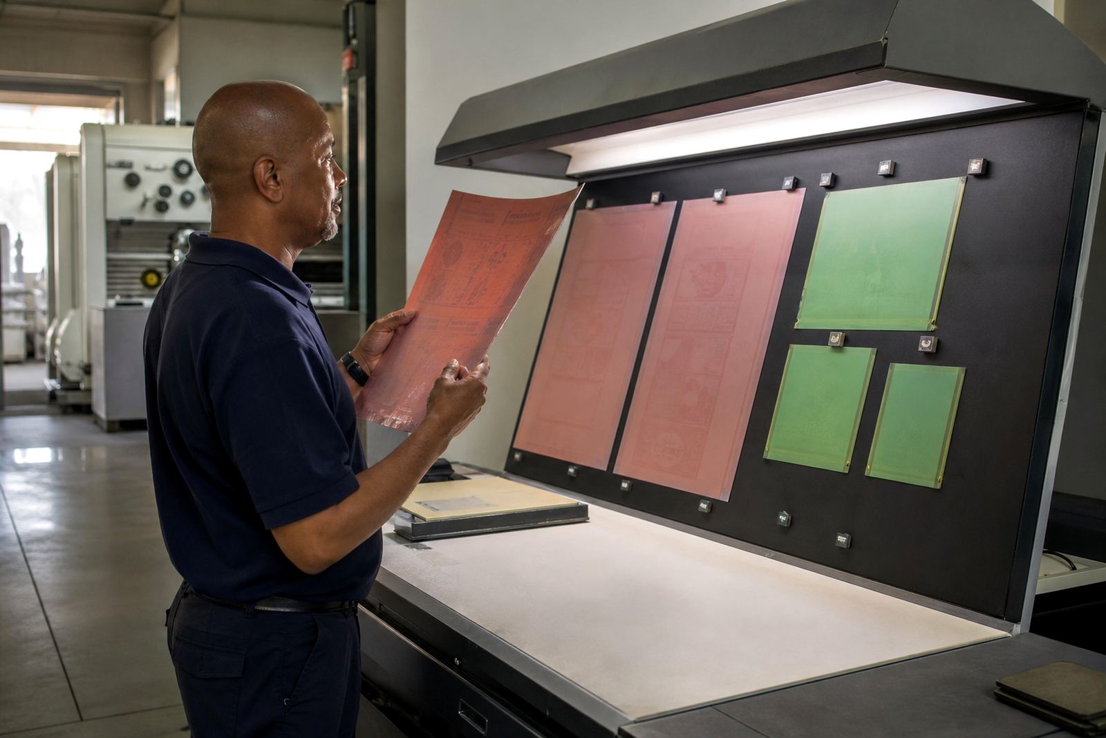
A good plate-making workflow does more than produce a finished plate. It supports the whole label job from file check through to the pressroom. For beverage labels, that workflow should be calm, accurate and built around the way curved containers behave in real use.
That normally means:
- Artwork reviewed for print fit and container shape
- Files checked for image quality, fonts and overprints
- Imposition planned to suit press layout and material use
- Screening support matched to the detail in the artwork
- Proofs compared against the intended label position
- Plates trimmed, labelled and packed for dispatch
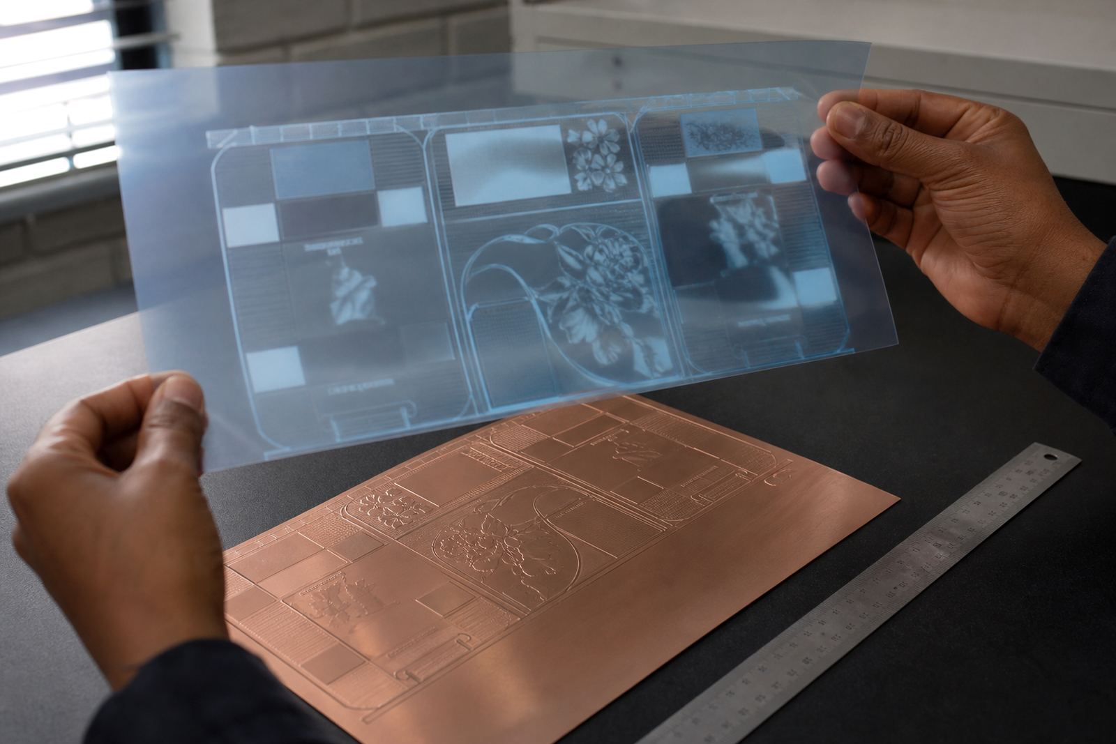
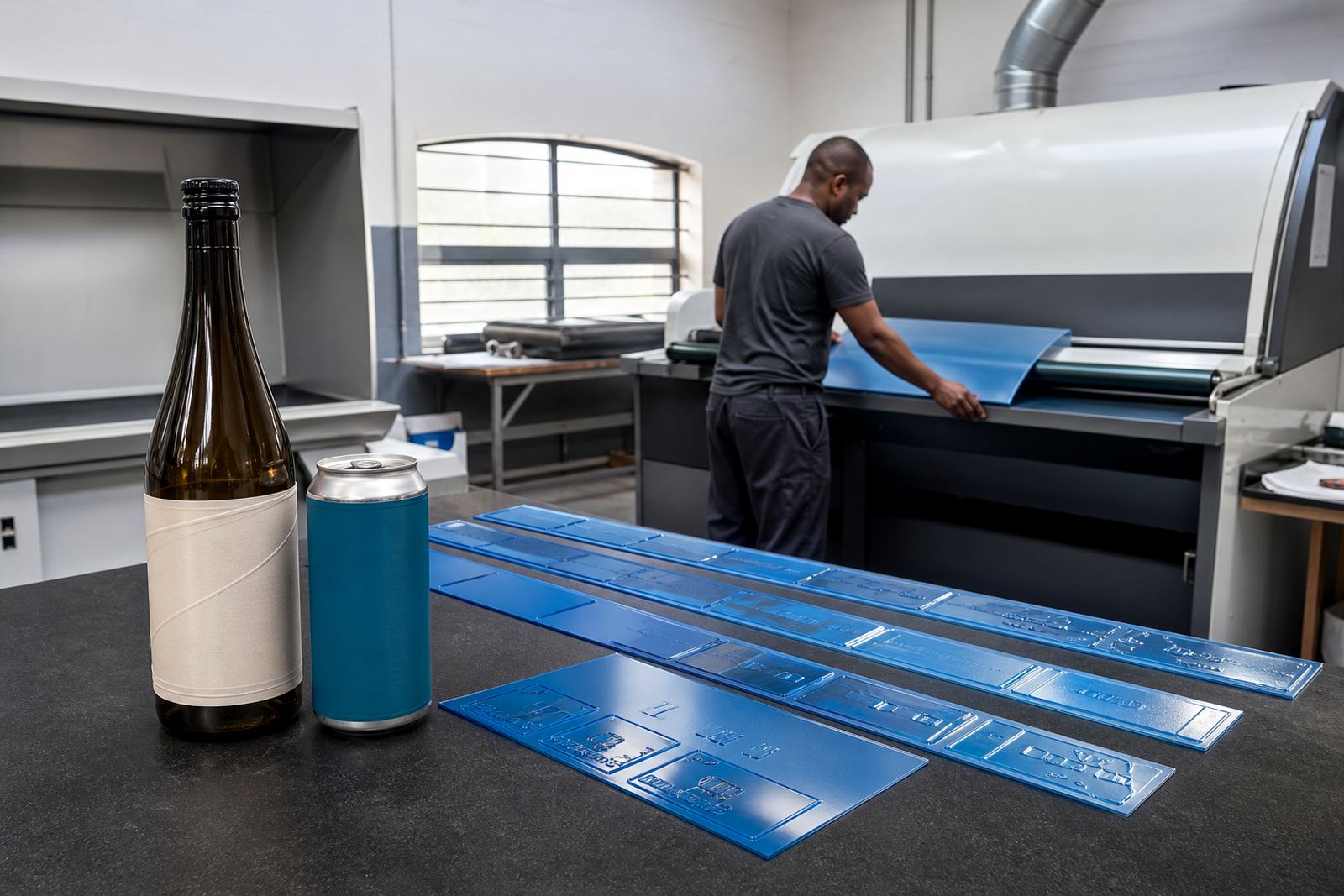
Flexo photopolymer plate-making is at its best when the job has been thought through properly. For beverage labels, that means fewer surprises at make-ready and a better chance that the first production run matches what the client signed off. It is not about overcomplicating the work. It is about making sure the curve has been allowed for before the plate is made.
A practical example from a South African beverage label run
Consider a small drinks producer in Pretoria preparing a short run of bottled flavoured water for retail and events. The bottle has a noticeable shoulder and a narrow wrap panel, so the label must carry brand colour, ingredients and barcode without crowding the seam. If the artwork is set up as though it were flat, the logo can look too wide once applied and the copy may sit too low near the base.
In that kind of job, the better route is to check the file carefully, compare the proof against the bottle profile and adjust the layout before plate-making starts. The result is a label that reads properly on the shelf and still behaves on the filling line. For the printer, that saves time. For the client, it reduces waste and keeps the pack looking like it should.
That is the real value of planning for beverage label curves. The issue is not just how the label looks in the artwork folder, but how it performs on the container once it leaves the press. Get that right early, and the rest of the job is much easier to manage.