
What colour separation means before plate making
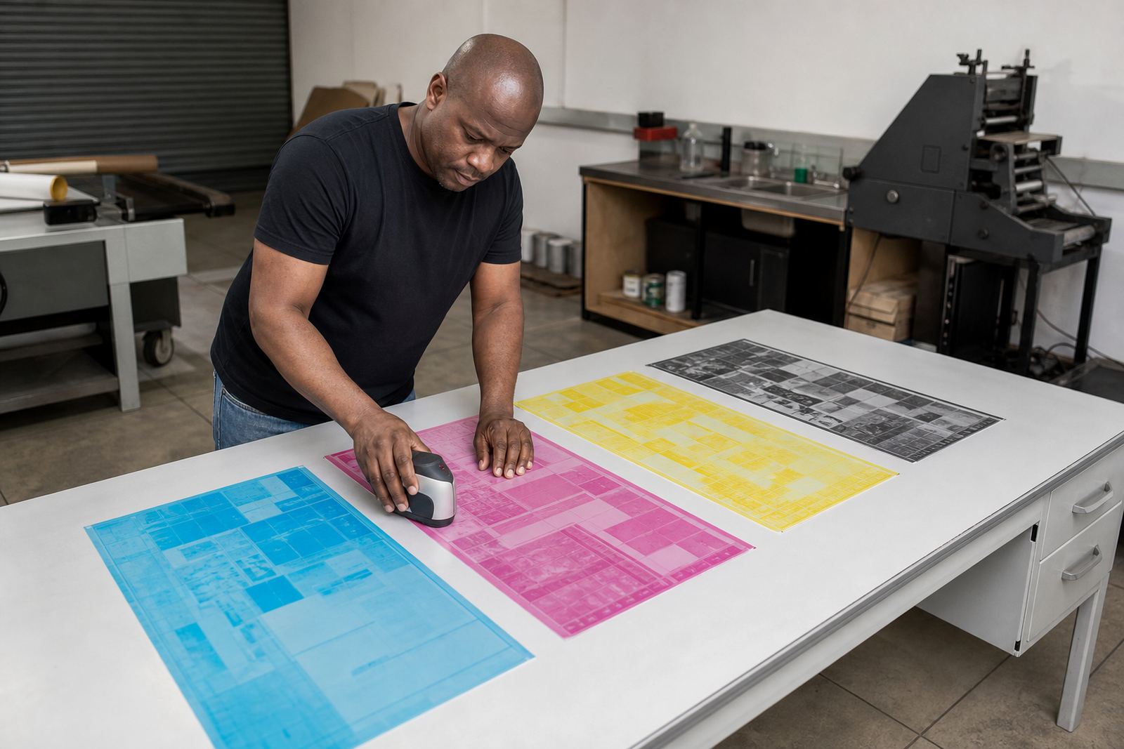
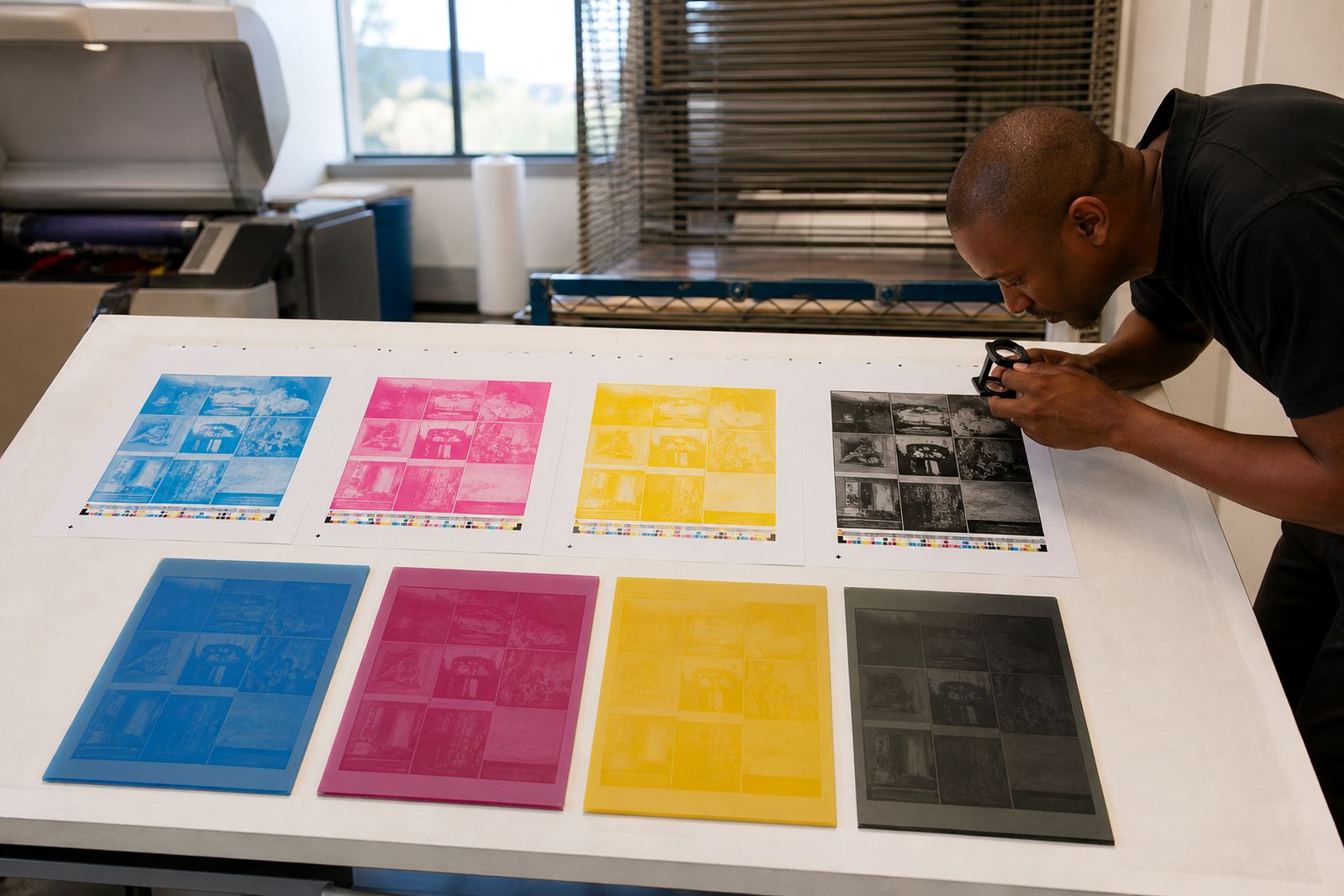
Colour separation is the step where artwork is split into the individual printing plates needed for a job. In flexo work, that usually means process colours, spot colours, or a mix of both depending on the substrate, the press setup, and the final look the customer wants.
For a beginner, the easiest way to think about it is this: one image may look like a single picture on screen, but on press it often needs several plates to build the final result. Each plate carries one colour. If the separations are weak, the finished print can look dull, muddy, or out of register. If they are planned properly, the job prints cleaner and setup on press is simpler.
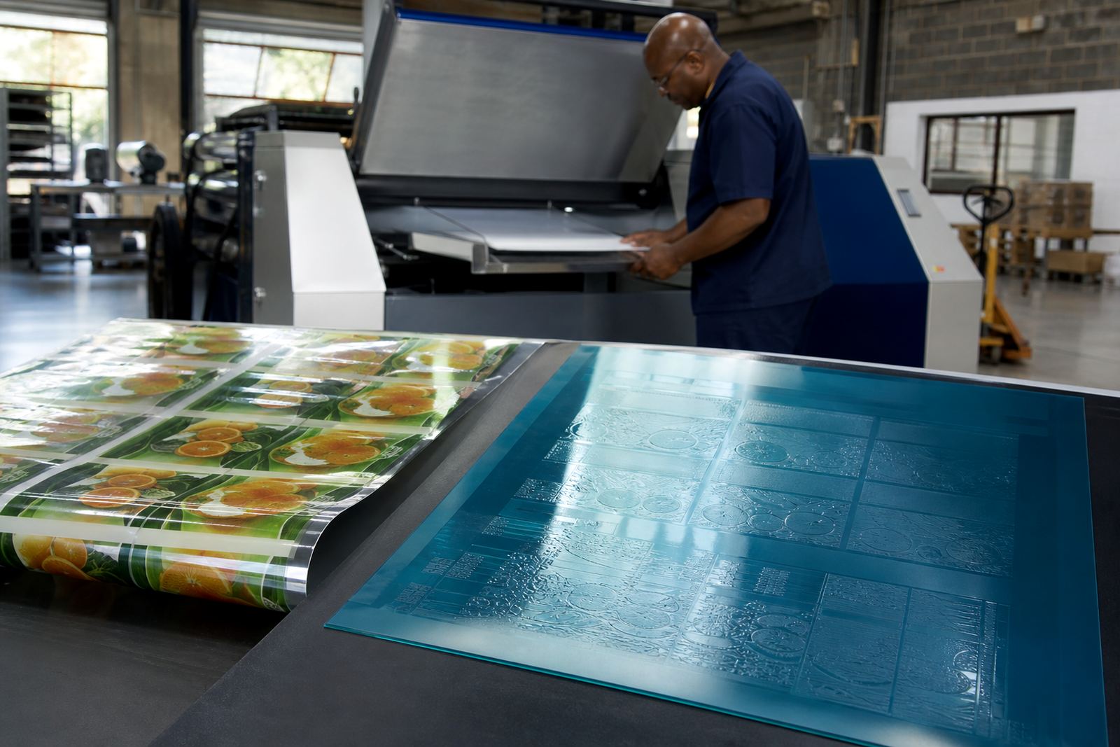
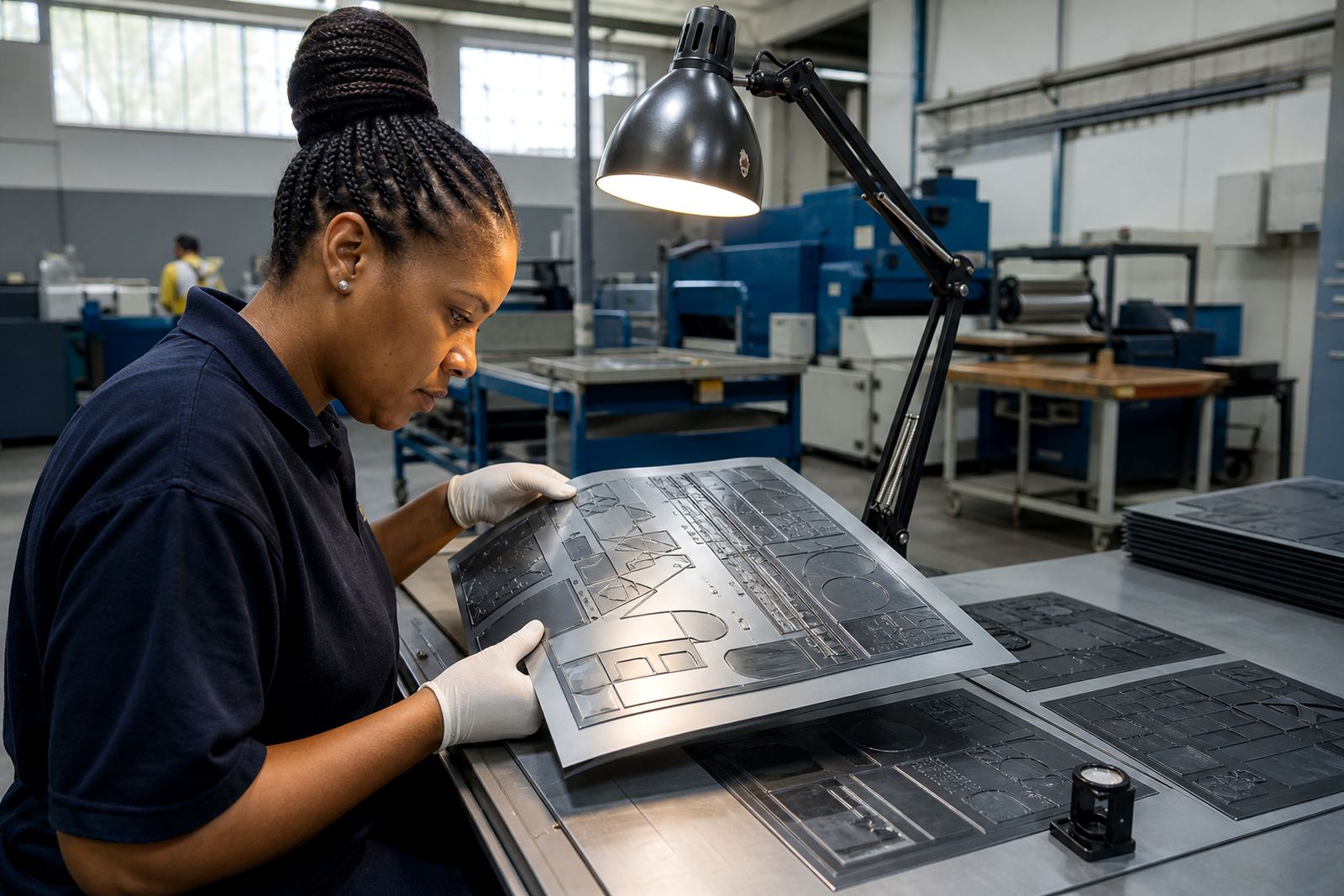
At our Midrand base, we handle flexo photopolymer plate-making for label and packaging printers across Gauteng and further afield. Good separation work starts long before the plate is trimmed. It starts with checking the file, understanding the print method, and knowing how the artwork will behave on the press.
Process colour and spot colour are not the same thing
Process colour uses a standard set of inks to build images and pictures. It works well for photographs, gradients, and artwork with many tones. Spot colour uses a specific ink mixed to a chosen shade and printed as a separate colour. That is common for logos, brand colours, cartons, and labels where consistency matters from run to run.
Many flexo jobs use both. A label may have a process image plus one or two spot colours for branding and text. That mix gives the printer control over detail and colour accuracy. It also helps when the job must print on materials that absorb ink differently, such as coated paper, film, or board.
- Use process colour for images, fades, and complex artwork.
- Use spot colour for logos, solid brand panels, and exact colour matching.
- Use both when the design needs detail and brand consistency.
- Check whether the artwork was built for flexo, not only for screen viewing.
One common mistake is assuming that every bright colour on a monitor can be matched directly on press. In practice, ink, substrate, and plate dot gain all influence the result. That is why file checking and proof comparison matter before plate production begins.
Why file checking saves time and material
Before plates are made, the artwork should be checked for font issues, image quality, colour build, trapping, overprint settings, and missing elements. This is not just admin work. It affects whether the plate will reproduce cleanly and whether the printer can run the job without avoidable stops.
In flexo, a file that looks fine on a laptop may still cause trouble on press. Small text can fill in, thin white reverses may disappear, and poor contrast can make barcode areas risky. On packaging jobs, even a small error can mean rework across a full production run. That is why preflight and file checking are part of a proper plate-making workflow, not an optional extra.
For printers in Johannesburg, Pretoria, Durban, Cape Town, and Gqeberha, courier delivery makes planning even more important. If a remake is needed, time is lost in transport as well as production. A careful check at the start reduces the chance of delays later on, especially when the job must move between design, plate work, and press on tight schedules.
- Confirm the correct artwork version before output.
- Check text size, line weight, and reversed type.
- Make sure embedded images are sharp enough for print.
- Review colour builds and any special ink callouts.
- Compare the proof against the approved artwork before release.
How spot colour separation affects labels and packaging
Spot colour separations matter most when a brand needs a stable look across different print runs. Packaging often has larger solid areas, metallic inks, tints, and finishing requirements that need clean plate output. Labels can be even more demanding because text, barcodes, and small graphics sit close together.
Flexo printers know that solid blocks of colour can expose weaknesses in separation very quickly. If a spot colour is built badly, it may print with patchy density or show unwanted edges. If the trapping is too tight, there can be gaps. If the separation is too loose, overlaps can become visible. A good prepress approach balances all of this so the plate supports the press rather than fighting it.
A local example is a small food producer in Midrand running sachet labels for a market line. The design may need a strong brand red, black text, and a process image for the product. In that case, the red should be separated as a spot colour if consistent brand appearance is important, while the image is handled through process build. That keeps the label clear and the brand easier to control across repeat orders.
Screening, dot gain and the realities of flexo
Screening support is another part of colour separation that beginners often overlook. In flexo, dots behave differently from what they do in digital viewing or office printing. Dot gain can make tones appear darker, especially on absorbent materials or where press conditions vary. The plate, the anilox setup, the ink, and the substrate all play a role.
That is why separations are not just about colour count. They are also about tone control. Fine highlights can drop out, shadows can plug, and midtones can shift if the file was not prepared with flexo in mind. When screening is set with the press conditions in mind, the plate has a better chance of holding detail through the run.
Load-shedding can also affect production planning in South Africa. When power interruptions interrupt workflow, jobs need to be organised carefully so that proofing, plate making, trimming and dispatch can continue with less disruption. A practical separation plan supports that by reducing rework and avoiding last-minute changes when time is already tight.
A simple prepress checklist for beginners
If you are preparing artwork for flexo plates for the first time, keep the process simple and check the basics before release. The more consistent the file, the fewer surprises on press.
- Confirm the final trim size and bleed.
- Keep text readable and avoid very fine reversed type.
- Separate spot colours clearly and name them properly.
- Check black usage so rich black and solid black are not mixed by mistake.
- Review any overprint, knockout, and trapping settings.
- Make sure the proof matches the intended print result.
- Send the latest approved version only, not a previous revision.
If anything is unclear, technical job advice at the prepress stage is cheaper than correcting a plate after dispatch. Plate trimming, labelling, remake support, and collection coordination all become easier when the original separation work is sound. That is especially useful for printers working across East Rand and West Rand industrial areas where production schedules can shift quickly.
At Flexo Printer Plates in Midrand, the aim is straightforward: help label and packaging printers get separations right before plates go out. Whether the job is headed for a short run or a repeat production order, accurate separation work supports better print quality and fewer delays.