
Why fine text fails first in flexo
Small type is usually the first thing to lose clarity on a flexo job. When letters are too close together, strokes are too thin, or the plate carries more gain than the artwork allows, the result can be filling in, broken characters or a soft edge that looks untidy on shelf labels and cartons.
Photopolymer plates can reproduce fine detail very well, but they still need the job to be prepared with the press in mind. A good plate maker will look at the artwork, the substrate, the anilox setup and the ink system before deciding how fine the text can safely go. On coated board you may get cleaner detail than on rougher film, so the same font can behave very differently from one job to the next.
For printers around Midrand, Johannesburg and Pretoria, this matters on short runs as much as on larger packaging work. A small line of legal text on a pouch, or a batch code panel on a label, can become unreadable if the plate is not matched properly to the job.
Artwork checks that protect small type
The best way to avoid trouble is to catch problems before imposition and plate output. Fine text should be checked for font weight, reversal, minimum size and knock-out conditions. If the type is built from a thin font family, or if the artwork has been scaled down too far, the plate may not hold the letterforms cleanly.
- Keep small positive type clear and simple, with enough stroke thickness to survive impression.
- Avoid reversing tiny text out of dark solids unless there is enough contrast and plate support.
- Watch out for over-stretched fonts, especially on multilingual packs with long product descriptions.
- Check that barcode text and date lines do not sit too close to folds, seals or trim.
At Flexo Printer Plates, artwork preflight and file checking are part of the job before plate production starts. That gives time to flag risky text, check line weight and confirm whether a small amendment would save a remake later.
Plate choices that affect letter sharpness
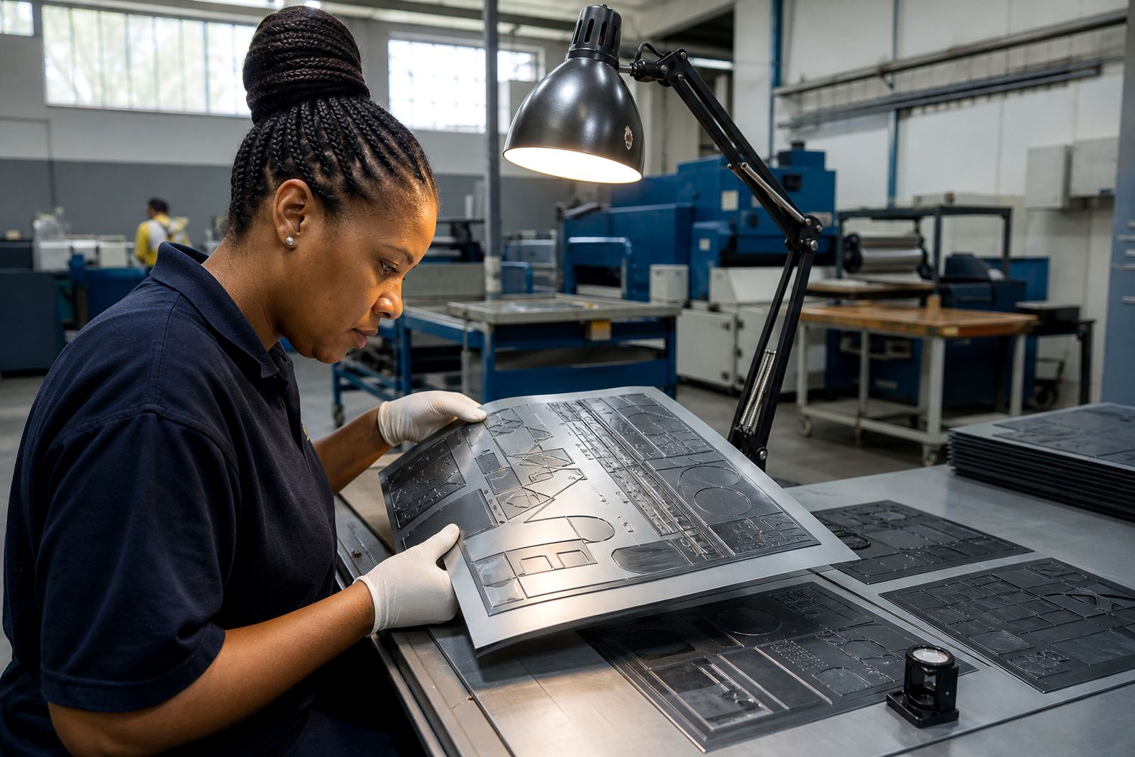
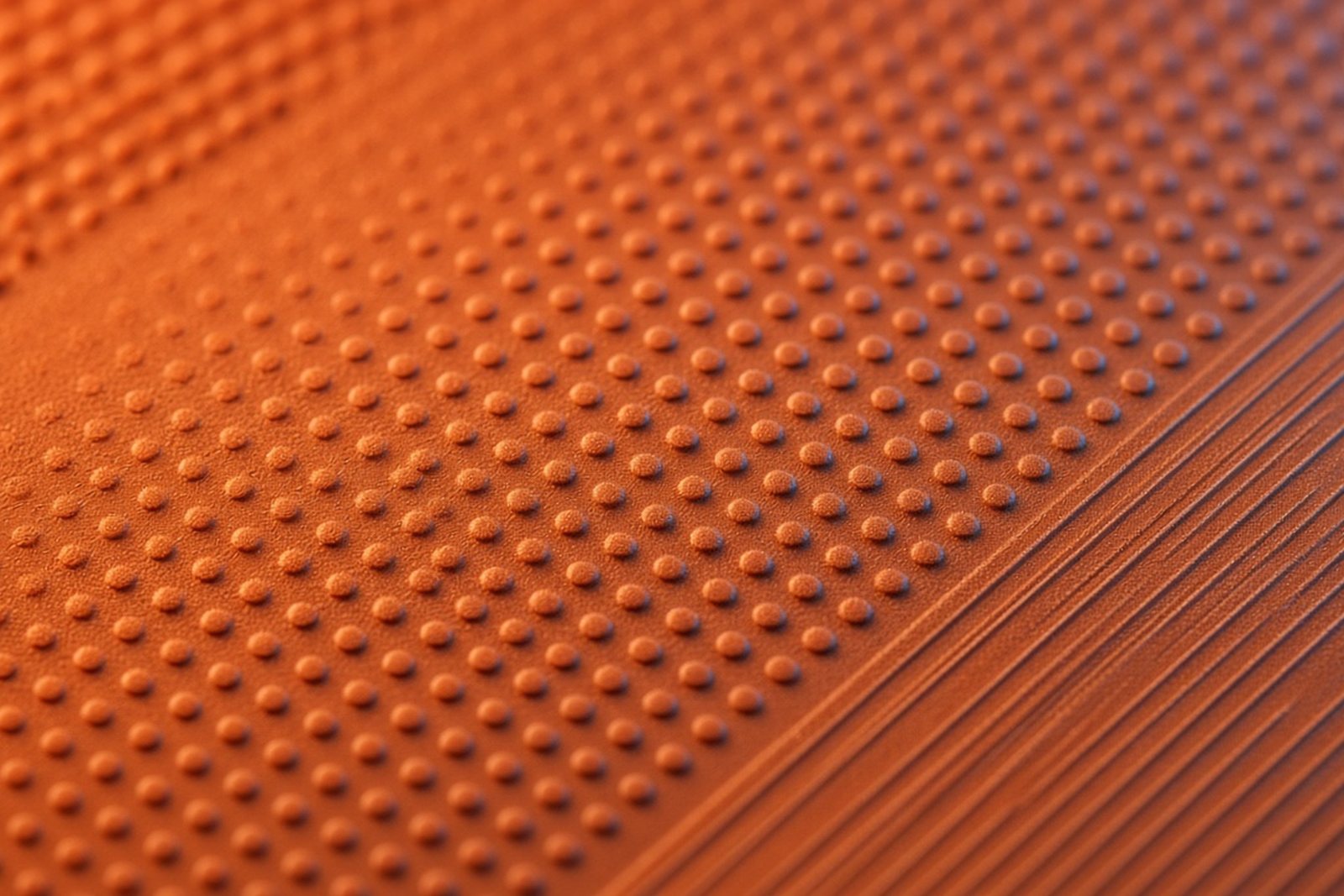
Not every plate image is the same. The way a plate is exposed, washed out and finished changes how much detail it can carry. Fine text benefits from clean dot formation, stable relief depth and consistent plate trimming, because uneven edges can show up as fuzzy letter edges once the plate is mounted.
Screening also plays a part. If the highlight structure around the text is too coarse, or if the plate is built for a very heavy impression, small letters can start to close in. A careful balance is needed between print durability and the need to hold clear copy. That is especially true on self-adhesive labels, flexible packaging and cartons with dense information panels.
Plate mounting matters too. If the plate is not mounted straight, or if tape build-up creates an uneven surface, fine text can print inconsistently from one end of the sheet to the other. That is why plate mounting and job advice belong in the same conversation as the artwork itself.
What printers should ask before approving the plate
Before a fine text job is signed off, it helps to ask a few practical questions. These can save time on press and cut down the chance of a remake. The goal is not to make the artwork more complicated, but to make sure the plate will reproduce it as intended.
- Is the smallest text still legible at final size, not just on screen?
- Does the job need a proof comparison before plate output?
- Will the text sit on film, board or another surface that changes impression?
- Are there any reversed words, fine rules or tiny legal lines near the trim?
- Has the file been checked for missing fonts, low resolution images or hidden overprints?
For label and packaging printers in Gauteng and beyond, this kind of review is especially useful when jobs are moving quickly between design, prepress and dispatch. A small file issue on a fine text panel can stop the whole job, so it pays to check early.
A local example from a Johannesburg label run
A common example is a food label printed for a Johannesburg customer with ingredients, batch details and a small handling notice. The decorative parts of the label may print easily, but the fine text in the information block can be the weak point. If the copy is too tight, or if the text is placed over a tinted background, the plate may need adjustment before printing begins.
In that kind of job, the practical steps usually include proof comparison, checking the artwork against the final substrate and confirming the plate trim so the small text stays centred. Courier delivery then gets the finished plates out to the printer without extra delay, whether the site is in Pretoria, Durban, Cape Town or Gqeberha. For East Rand and West Rand jobs, collection coordination can also help when the press schedule is tight.
In Midrand, where many printers work to short lead times and sometimes around load-shedding, a clear prepress process reduces waste and keeps the plate room moving. It is less about fancy language and more about making sure the letters stay where they should be.
How we help keep fine text printable
Fine text work needs careful handling at each stage, from file checking through to dispatch packing. Flexo Printer Plates focuses on plate making for label and packaging printers, with support that includes imposition planning, screening support, plate labelling, remake support and technical job advice. The aim is to give printers a plate that fits the job, not just the artwork.
That support is useful whether the job is a small batch of retail labels or a larger packaging run. In coastal areas, humidity can affect storage and handling, so clean packing and organised labelling matter too. On the receiving side, clear plate identification helps the press crew load the right set quickly and avoid mix-ups.
- Artwork preflight to catch fine text risks before output.
- Proof comparison to confirm copy, spacing and legibility.
- Plate trimming and labelling for cleaner handling on site.
- Dispatch packing and collection coordination for South African delivery routes.
From our Midrand base, the team works with printers across Johannesburg, Pretoria, Durban, Cape Town and Gqeberha, as well as the surrounding industrial areas. Sibusiso Mthembu leads the business, with support from Ayesha Naidoo, Pieter van Wyk, Lerato Molefe, Morne Jacobs and Zinhle Dlamini across production, prepress, client service, mounting and logistics.
A simple rule for better small type
If the copy matters, treat it as a production feature, not an afterthought. Fine text should be checked at artwork stage, tested against the job conditions and approved with the same care as the main image or brand name.
That approach saves time, cuts down on remake risk and gives the printer a better result on press. In flexo, small type rewards careful planning more than anything else.