
Small type needs a clean path from artwork to plate
When a label carries batch codes, ingredients, barcodes or a legal notice, the smallest text can become the most important part of the job. If the artwork is crowded, the plate still has to carry every line clearly enough for the press to transfer it without filling in counters or breaking thin strokes. That is why legibility must be treated as a production issue, not only a design one.
At our Midrand base, we see this on work for label and packaging printers every week. A design that looks acceptable on a monitor can become weak once it is reduced for a small wrap label or squeezed onto a narrow carton panel. The first check is simple: make sure the type size, line spacing and contrast are suitable for the final print size, not just for the layout on screen.
- Keep key information in a clean, open area of the label.
- Avoid placing small type over busy background graphics.
- Leave enough space around barcodes and compliance text.
- Check that reversed text will still hold on the chosen substrate.
Choose typefaces that survive flexo conditions
Some type styles are fine in digital artwork but do not suit flexo printing, especially when text is small. Light weights, very thin serifs and tight condensed styles can close up if the plate carries too much shoulder or if the impression is set too hard on press. On labels, the safest route is usually a simple face with clear letterforms and enough weight to hold detail after plate making.
There is also the matter of substrate. A smooth film label can behave differently from a textured paper stock, and a coated carton is not the same as an uncoated one. Coastal humidity can also affect materials in storage and during handling, so the same file can perform differently in Durban than it does on a dry inland site. Good legibility depends on matching the typography to the print condition, the board or film, and the actual press setup.
- Use type that remains clear at the final trimmed size.
- Do not rely on hairline rules to frame important text.
- Choose strong contrast between text and background.
- Be careful with knocked-out text on deep solids.
Prepress checks protect the text you cannot afford to lose
Artwork files often arrive with details that look neat on a computer but create trouble in plate preparation. Poorly trapped elements, incorrect overprint settings, low resolution images and out of scale text can all reduce clarity. That is why file checking and artwork preflight matter before plate making begins. A problem found early is easier to fix than a job already on the press floor.
We review line weight, font usage, image quality, imposition and the balance between copy and white space. If a label has fine print or tiny codes, we also look at whether the layout allows those elements to reproduce cleanly on the plate. For Flexo Printer Plates, founded in 2007, this part of the process is about practical control. A file may be acceptable in principle but still need adjustment so the final plate supports the text properly.
- Check that all fonts are correctly embedded or outlined.
- Confirm that barcodes have enough quiet space around them.
- Review spot colours and build-ups that may affect contrast.
- Compare the output size against the actual label dimensions.
Plate preparation affects how much detail reaches the press
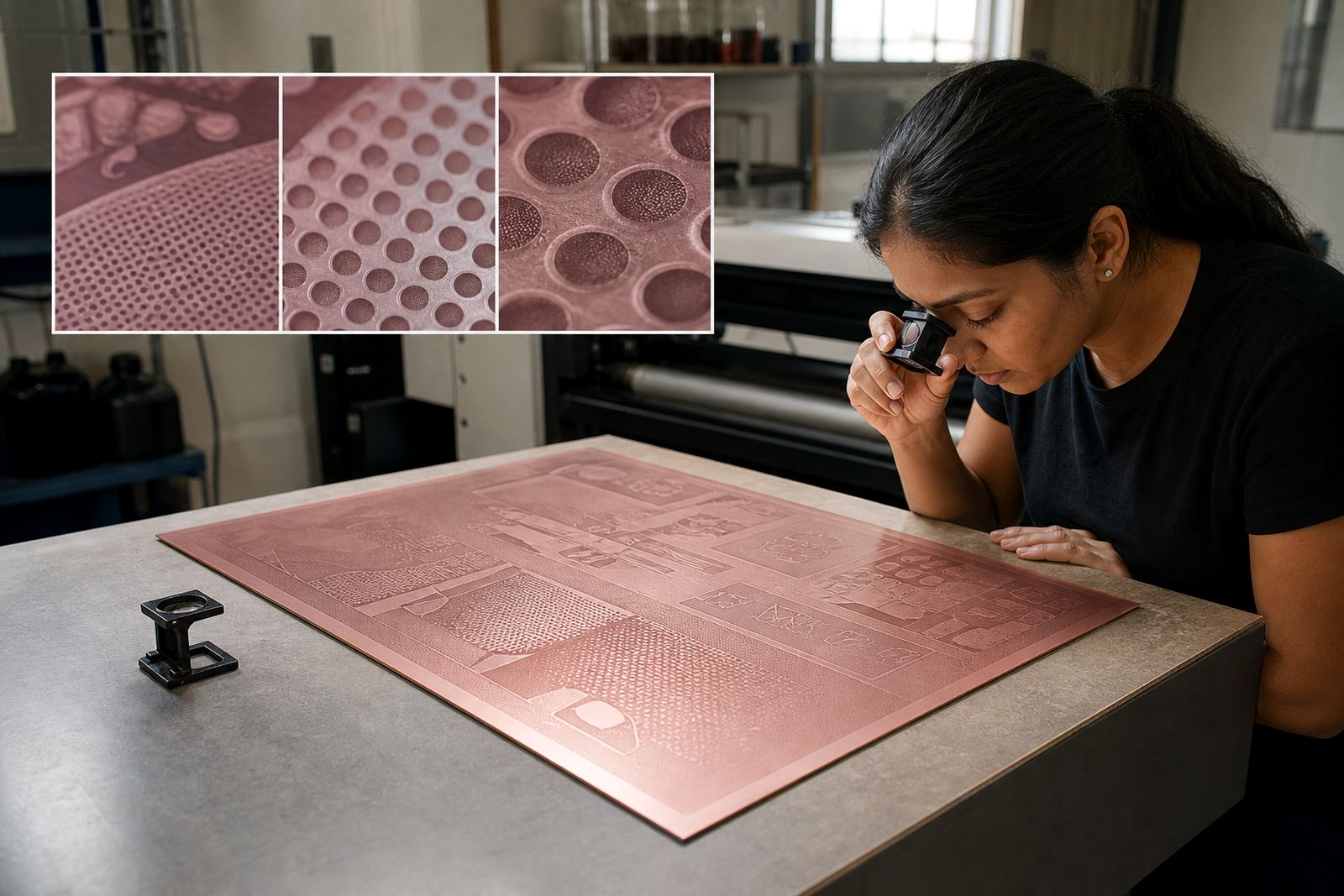
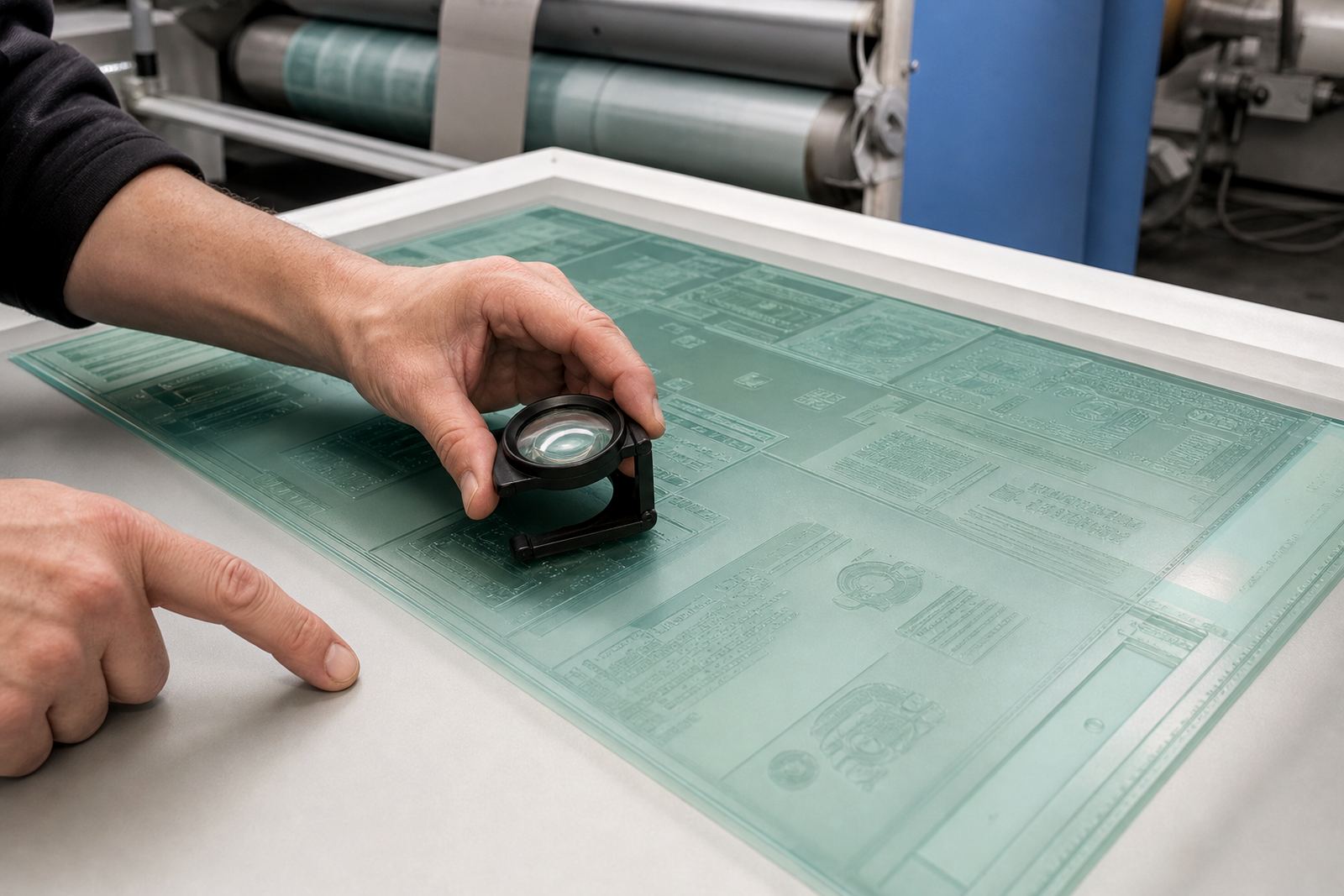
Photopolymer plate-making is not just about copying artwork onto a surface. It is about making sure the right dots, lines and letter shapes are held with enough detail for the printer to reproduce them. Exposure, washout, drying and finishing all influence how sharp the text appears. If the plate is over-processed or under-processed, small letters can lose definition and fine punctuation may disappear.
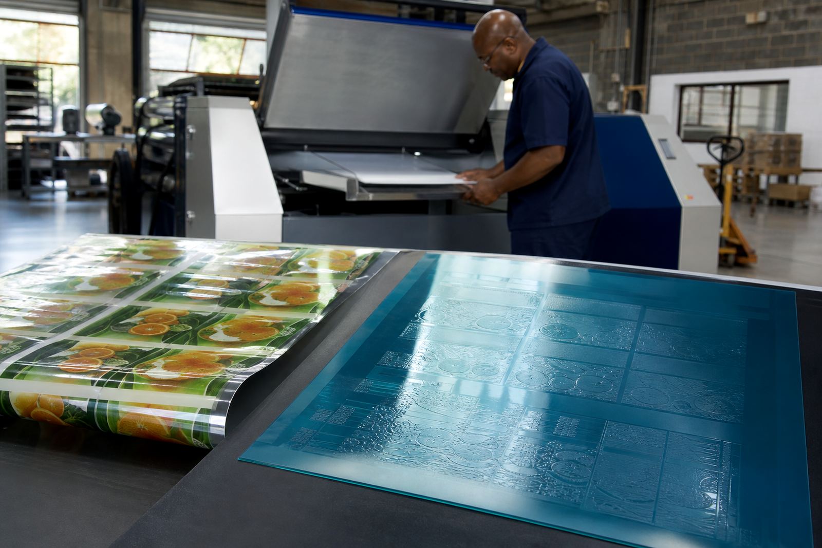
Our plate-making service covers the full path from file checking through to plate trimming and plate labelling, with technical job advice where needed. For label work, the plate must carry clear text while still being practical for mounting and press handling. A plate that is cleanly finished and correctly labelled saves time on press and reduces the chance of mix-ups during make-ready.
We also help with remake support when a job needs a fresh plate after an artwork amendment or production issue. That support matters on busy packaging lines where a changed code, ingredient line or regulatory note cannot be left to chance.
Proof comparison should focus on the words that matter most
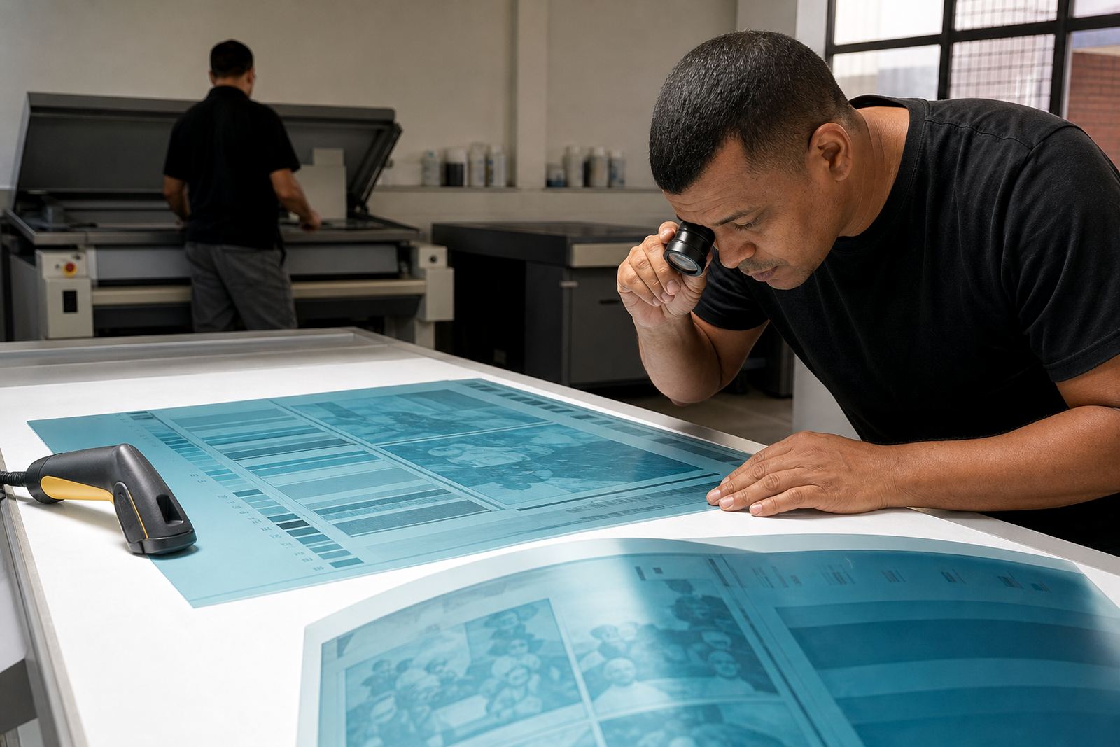
Proofs are often checked quickly, but the parts that matter most on a label are usually the smallest. Proof comparison should focus on spelling, spacing, alignment and whether the smallest lines remain readable under normal viewing conditions. A neat proof is not enough if the legal line is cramped or the barcode number is too tight to scan cleanly.
For printers working under time pressure in Johannesburg, Pretoria or Durban, the fastest way to avoid rework is to compare the proof against the final artwork with a clear list of priorities. Start with the mandatory text, then the variable information, then the decorative copy. That order helps keep the label compliant and legible where it counts.
- Check every number, unit and abbreviation carefully.
- Read the label at arm’s length, not only close up.
- Confirm the barcode and human-readable digits together.
- Look for letters that merge in small sizes, especially a, e, o, s and r.
A practical local example from Midrand to the coast
A small packaging printer in Midrand may send out a new label for a food product that needs a lot number, batch code and ingredient panel on a narrow face. The artwork looks tidy, but the legal copy sits on a dark panel and the smallest type is too light. Before plate making, the file is checked, the background is adjusted and the line spacing is opened slightly. The plate is then prepared so the text holds on press without flooding in.
That same job might be couriered to Cape Town, Gqeberha or Durban for production use, so the plate has to leave our base ready for handling and dispatch packing. We work with collection coordination and courier delivery across South Africa, including Johannesburg, Pretoria, East Rand and West Rand. In every case, the aim is the same: give the printer a plate that keeps the label text readable from first pull to final run.
Good legibility is not luck. It comes from careful artwork choices, sound prepress checks and plate preparation that respects the realities of flexo printing.